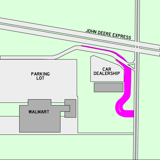
The pink is the new and improved entrance to Walmart. What’s wrong with this picture?
- Nothing, this is the best design possible.
- Oh, man! How am I going to hold on to my phone around all those curves?
- It needs to wrap around the car dealership more, maybe even a full loop
- Everything

City of Moline's Answer:
Well, since this is what they are implementing, I gues it’s the best they can come up with....
A. This is the best design possible.
Conventional Answer
D. What's not?
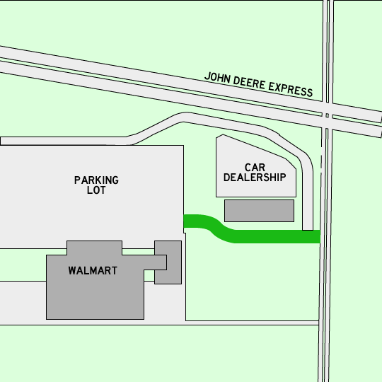
OK, I get it, the entrance needs to be farther from the stop light on John Deere so there is less pile-up. But why not something simple and direct, like the green lanes in tihs image?
